Cutting Cart Abandonment: WooCommerce Checkout UX
Most online carts never turn into orders. By most measures, around seven in ten get abandoned somewhere between 'add to cart' and 'payment confirmed'. Some of that you can't help, because people browse, compare and wander off. But a lot of it is the checkout itself getting in the way.
If you run a WooCommerce store, here's where we usually find the leaks and how we plug them.
Let people check out as guests
Forcing someone to create an account before they can pay is one of the oldest and most expensive mistakes in ecommerce. A first-time buyer doesn't want a relationship yet, they want the thing they came for. Offer guest checkout, and offer the account afterwards, when you can fill in half the form for them. WooCommerce supports this out of the box. Turn it on.
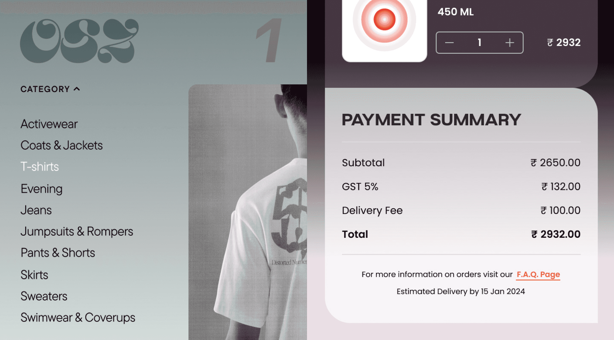
Show the full price early
Nothing kills a sale like a shipping cost that appears at the final step. People feel tricked, and they leave. Show shipping, or a clear estimate, as early as you can, ideally on the cart page. If you offer free shipping over a threshold, say so loudly, because 'you're four hundred rupees away from free delivery' is one of the few upsells customers actually thank you for.
Cut the form down
Every field is a small reason to give up. Ask for what you need to ship and bill the order, nothing else. Drop the company field on a store that sells to individuals. Use one address by default and only reveal a separate billing address if someone asks for it. Autofill the city and state from the PIN code. The shorter the form looks, the more people finish it.
Offer the payment methods people actually use
In India that means UPI, cards, net banking, and the wallets your customers already have, through a gateway like Razorpay or Cashfree. If someone's preferred method isn't there, you lose them at the last step, which is the most painful place to lose anyone. Match the methods to who is actually buying from you.
Make it work on a phone, properly
Most of your checkout traffic is on a phone. Big tap targets, a numeric keypad for the phone and PIN fields, no pinching to read the total. A checkout that's merely 'responsive' in desktop terms still feels clumsy on mobile. Test it on a real phone, on real mobile data, not a shrunk browser window.
Then bring back the ones who still leave
Some people will leave no matter what, often to finish on another device or after payday. A simple abandoned-cart email an hour or a day later wins back a real slice of them. Keep it short and useful: here's your cart, here's the link, done. WooCommerce has plenty of plugins for this, and it's close to free money once it's set up.
Where to start
If you do only one thing, turn on guest checkout and put shipping costs on the cart page. Those two fixes alone tend to move the numbers more than any redesign. Checkout isn't where you impress people. It's where you get out of their way.
If you want us to look at where your WooCommerce checkout is leaking, that's a quick audit we're happy to do.

Team
Let’s explore how we can bring your ideas to life.
See how we’ve transformed ideas into success stories