Ecommerce Design Trends That Matter in 2026
Every year someone publishes a list of ecommerce design trends, and every year half of them are last year's trends with a new screenshot. So instead of chasing novelty, here's what actually moves the needle for an online store in 2026, based on what we keep seeing work for the shops we build.
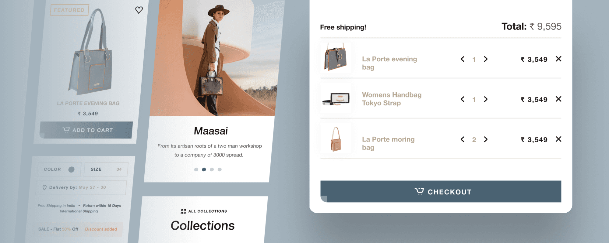
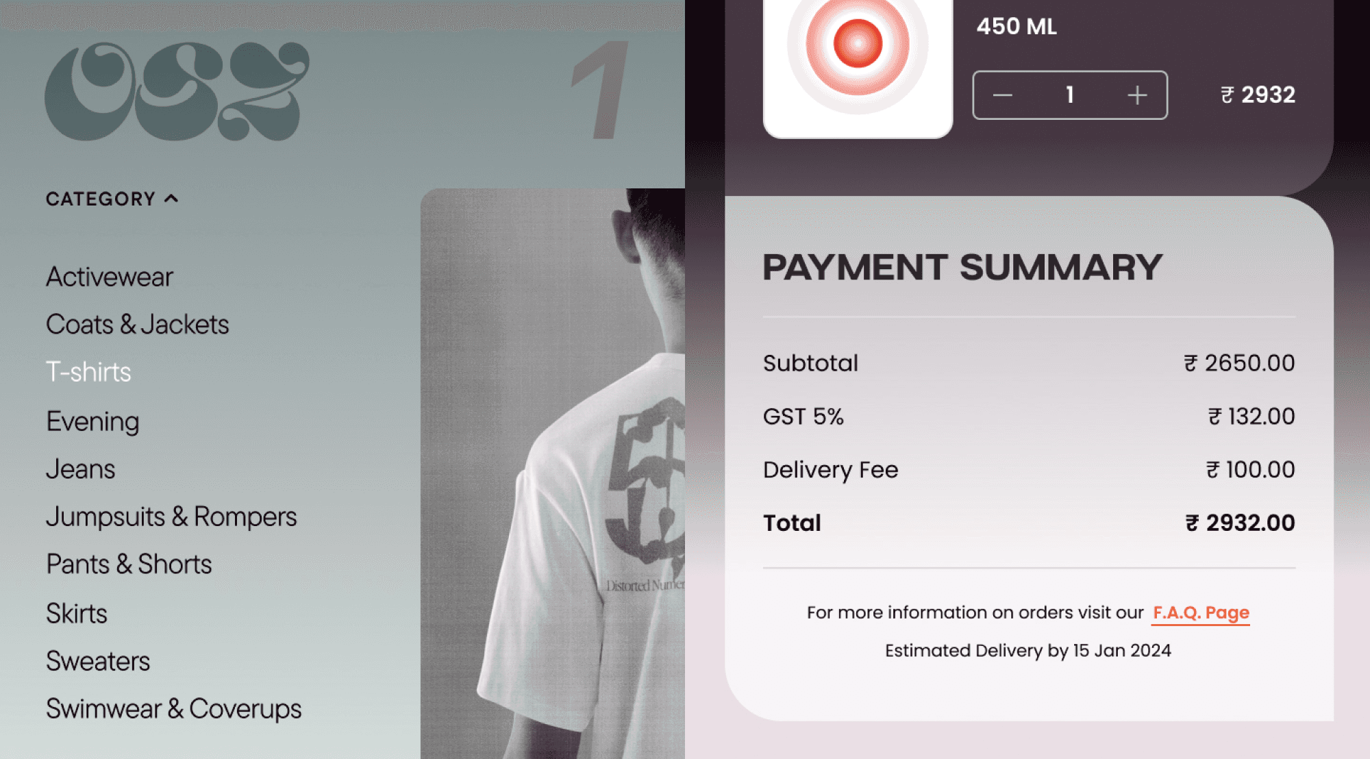
Mobile is the whole game now
Most ecommerce traffic comes from phones. The figure floats around 70 to 75 percent depending on whose report you read, but it has pointed one way for years. That changes where a project starts. You don't design a desktop site and squeeze it down. You design the phone version first, get the thumb-reachable buttons and the one-screen checkout right, then expand outward to desktop. Anything awkward on a small screen is a tax you pay on most of your visitors.
Speed is a feature, not a setting
People have stopped waiting. A page that takes an extra second to load loses sales, and search engines notice slow sites too. Most of the wins here are unglamorous: compress the images, drop the scripts you don't need, use a modern framework, cache properly. None of it shows up in a mockup. All of it shows up in the numbers.
Clean layouts, with a point
Minimalism is still the default, and for good reason. White space and a clear hierarchy let the product do the talking. But minimal doesn't mean empty. The job is to make the next action obvious: what is this, what does it cost, how do I buy it. If a visitor has to hunt for the price or the add-to-cart button, the clean layout has failed at the one thing it was for.
Personalisation that's actually useful
'Recommended for you' has been around forever. What changed is how good it got. Stores now read browsing and purchase history to surface the right products, bundle sensible add-ons, and adjust what a returning visitor sees first. Done well it lifts the average order value without feeling creepy. The trick is restraint: recommend, don't stalk.
Designing to be found by AI, not just Google
This is the real shift. A growing share of shoppers don't start on your site, or even on Google. They ask ChatGPT, Gemini or Perplexity for 'the best waterproof boots under five thousand rupees' and buy what the assistant suggests. If your product data is messy, the assistant can't understand your catalogue, and you don't get recommended. So structured data, clear product information, accurate pricing and stock, and clean metadata have quietly become a design and SEO priority. People have started calling it answer engine optimisation. We just think of it as making your store legible to machines as well as people. There's more on this in our piece on AI for ecommerce.
Conversational and assistive UX
Chat is no longer just a support box in the corner. Shoppers expect to ask a question in plain language and get a useful answer, whether that's sizing help, a comparison, or where their order is. A good assistant cuts support load and helps people decide. A bad one is an annoying popup. The difference is whether it actually answers.
The small stuff still counts
Microinteractions, the bit of feedback when you tap a button or add to cart, are worth getting right. So is accessibility: proper contrast, readable type, keyboard and screen-reader support. Both are easy to skip and obvious when they're missing. And a quiet, honest note about where a product is made or how it ships earns more trust than a banner shouting about it.
What we'd actually prioritise
If you only fix a few things this year, make it speed, mobile checkout, and clean product data. They aren't exciting, and they win. The flashier trends are worth it once the basics are solid, not before.

Team
Let’s explore how we can bring your ideas to life.
See how we’ve transformed ideas into success stories